10 Commandments of Typography and Color
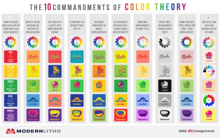
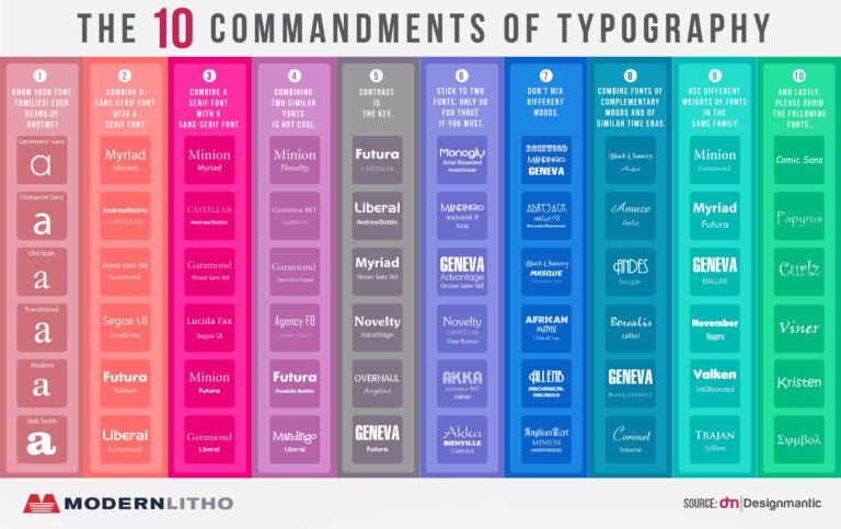
It can be tricky choosing the right font for your project, let alone the perfect color combination. That’s why we’ve scoured the web to find two really interesting infographics shared by DesignMantic that will help you to make better typography and color choices in your next creative project.
Using these key rules and suggestions can make your next project look and feel more professional. A great design will use these to draw the viewers eye through the design and emphasize important information.


Choosing a great color and typography combination is defiantly and art. If you have ever thumbed through fonts in a program font menu you know it can take time. But just remember, it is worth it. These graphics provided by DesignManic is a great way to see some of these great combination in one swoop of the eye.
Not saying these are going to solve all of your design team’s problems, but maybe it’s a good start. There are more challenges that design teams face and luckily we have thought of that as well. Check out our graphic about the 8 Biggest Challenges Creative Teams Face.
So, remember to take the time to choose the color and font combination that will really make your project pop! People will notice! Give them a try and just wait to hear some of the great feedback from your refreshed look!
Source: www.designmantic.com/blog/infographics/the-10-commandments-of-color-theory
Source: www.designmantic.com/blog/infographics/ten-commandments-of-typography/
