Latest Blogs

Greg Meeker, Chief Revenue Officer FOR IMMEDIATE RELEASE: Modern Litho Announces the Retirement of Greg Meeker, Chief Revenue Officer Jefferson City, Missouri – July 2, 2024 – Modern Litho, a leading Midwest-based commercial and publication printer, today announced the retirement of Greg Meeker, Chief Revenue Officer, effective June 30,…
Read More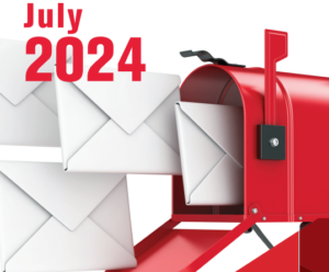
The United States Postal Service has posted updated 2024 rate changes. The price changes will take effect on July 14, 2024. First-Class Mail Forever stamp will increase by five cents to 73¢. First-Class domestic postcards will increase to 56¢. Percentage increases by class: 1st Class letters 5 Digit: 7.49% AADC:…
Read More

Darrell D. Moore, CEO FOR IMMEDIATE RELEASE: MODERN LITHO CEO DARRELL MOORE ANNOUNCES RETIREMENT AND JOINS PRINTING INDUSTRY HALL OF FAME Jefferson City, Missouri – May 1, 2024 – Modern Litho, a leading Midwest-based commercial and publication printer, today announced that Darrell Moore will be retiring as Chief Executive Officer,…
Read More
The United States Postal Service has posted updated 2024 rate changes. The price changes will take effect on January 21, 2024. Refer to the following chart for the latest 2024 USPS rates:
Read More
Take advantage of these promotions from USPS to save on postage for your next direct mail campaign. Did you know? The Postal Service delivered 127.3 billion pieces of mail to more than 164 million addresses across the country in 2022?! Now more than ever it is essential to get the…
Read More
When the owners of Brown Printing and Modern Litho-Print Co. merged their businesses under a corporate holding company on January 1, 2000, the decision was made for both companies to continue operating autonomously at their respective facilities and under their existing brand name. Since then, our planned growth has taken…
Read More
St. Louis, Missouri- November 15, 2023- Modern Litho, a full-service commercial and publication printer headquartered in Jefferson City, Missouri, today announces a new location for its St. Louis operation. The new facility, located at 5001 Southwest Avenue on The Hill, will accommodate more than 67,000 sq. ft. of production and administration space,…
Read More
Jefferson City, Missouri, September 26, 2023- Modern Litho, a nationally recognized full-service commercial printer and mailer based in Mid-Missouri, announces it has signed a letter of intent to acquire Direct Impaqt, formerly Mail & More and Brake Printing, of Columbia effective October 2, 2023. Both companies have served the Columbia market…
Read More